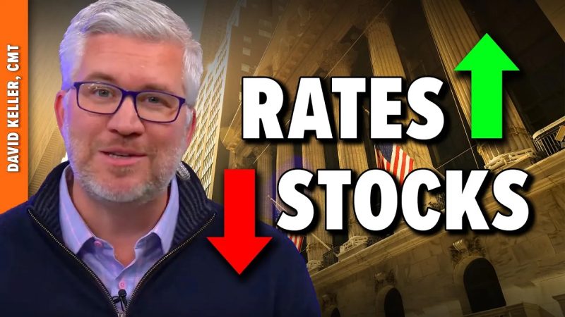
In this video, Dave shares a long-term analysis of the Ten-Year Treasury Yield, breaks down how the shape of the yield curve has been a great leading indicator of recessionary periods and weaker stock prices, and outlines the chart he’s watching to determine if early 2025 will look a great deal like early 2022.
This video originally premiered on January 6, 2025. Watch on StockCharts’ dedicated David Keller page!
Previously recorded videos from Dave are available at this link.
previous post
